Dialogue UI / original fictional example
A missing page.
A clear next choice.
A dark-fantasy dialogue panel, character nameplate and three choice states. Inspect the composition, then open the editable SVG or download the review kit.
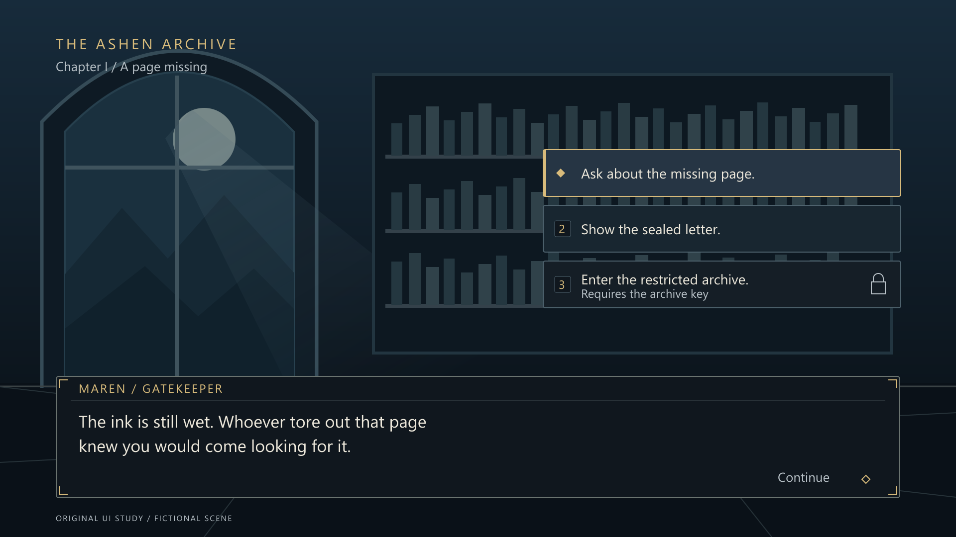
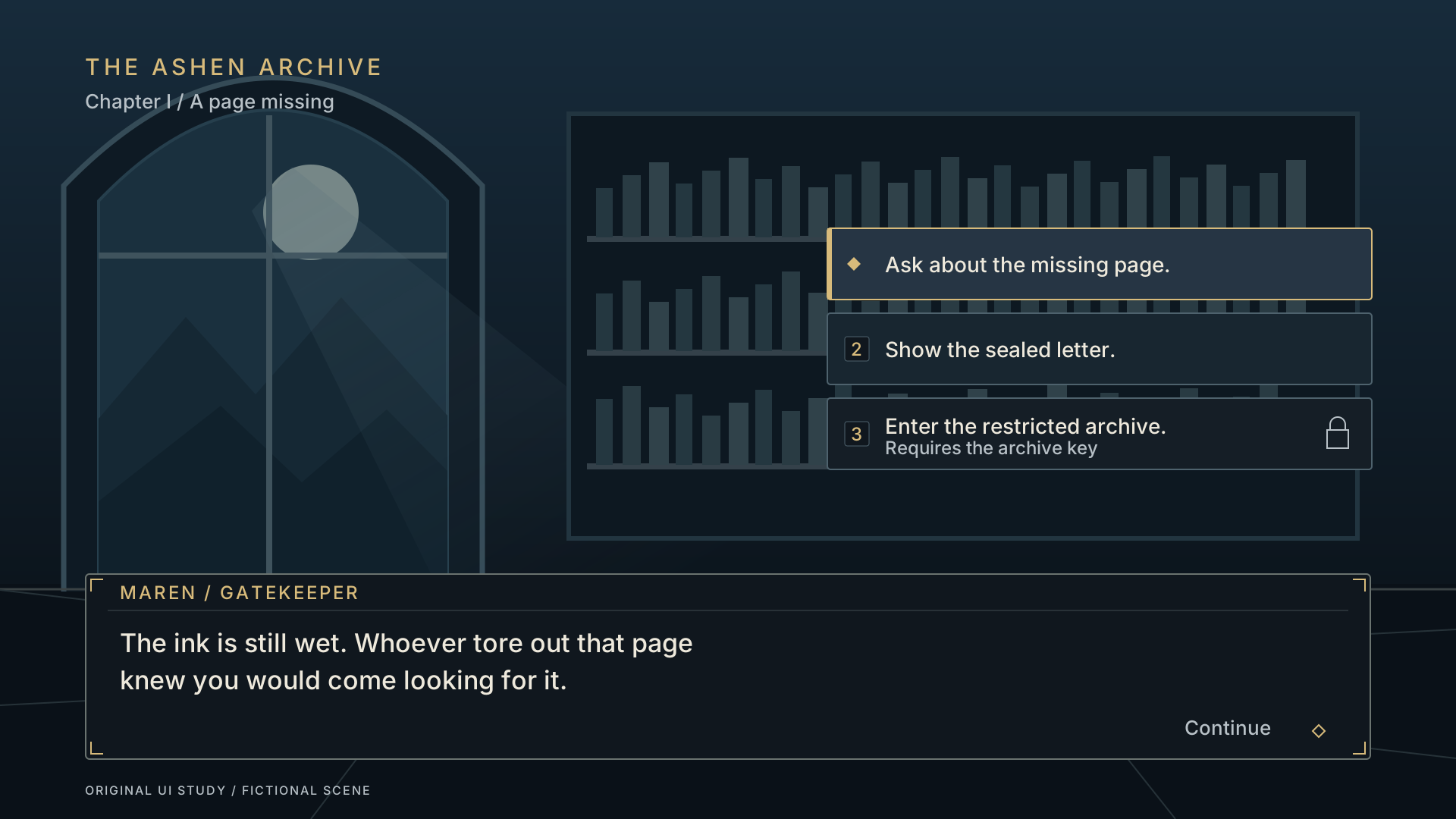
State is more than color.
The focused choice has a brass border and diamond. A locked choice includes a padlock and a written requirement. The dialogue surface stays opaque so the scene cannot obscure its text.
At half size, dialogue is equivalent to 17px, choice labels to 14px and the nameplate and locked requirement to 12px. These are measurements of the scaled desktop preview.
Six selected text/background color pairs measure 9.23:1 to 14.89:1. This does not certify a complete game as accessible. Mobile game layout and input behavior have not been tested.
FOCUSED

DEFAULT

LOCKED

Inspect the editable files.
The review kit contains five SVG files and six PNG exports. Text and geometry remain editable in the SVG. System fonts are referenced rather than bundled.
These PNGs contain demonstration text. A game implementation would use runtime text, appropriately sliced backgrounds and an agreed target layout. No Unity, Naninovel or Godot integration is included or claimed tested.




A small first design task
Discuss a $25 dialogue UI pilot.
One dialogue panel, character nameplate and three choice buttons, with editable SVG and PNG exports at an agreed canvas size. One consolidated revision. Target: two business days after the brief, references and payment terms are agreed.
Send a reference, target resolution, text-length constraints and deadline. Exact scope, feasibility, use terms and price are confirmed before work begins. Engine implementation and full menu sets need separate scoping.
Discuss your dialogue UI brief